-
Categories
- All Winners
- Branding
- Environmental Graphics
- Interactive
- Miscellaneous
- Motion Graphics
- Packaging
- Publications
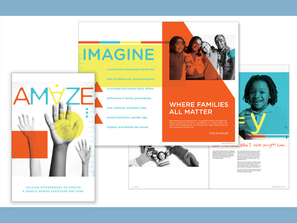
AMAZE Organization Brochure
By IMAGEHAUS
The Idea
The piece was a part of a bigger rebranding project and the objective of the overall project was to simplify the Amaze brand. We were tasked to create a new look for Amaze that would match the credibility and their ability to empower young people, so they can make a difference in our diverse world. The inspiration for the design was drawn from the basics of childhood – primary colors and basic shapes. The building blocks of learning for all children, regardless of race, religion, ability or social-economic status. As an anti-bullying organization, the universality of the visuals was spot-on.
Delivery of Work
For the intitial disbursement, the brochure was handed out to the guests at a fundraiser for the organization. The guests were friends and supporters of the organization. The oversized format of the brochure allowed us to spotlight the children involved in the program in a dynamic way. The information was designed to accomodate two audiences. First, donors who don't have time to read the entire publication can read the call-outs and understand the impact of the work done by AMAZE. On the other hand, educators prefer the longhand version to better understand the specifics and the value of AMAZE and its programs.
The Results
The client is extremely happy with the outcome of the rebranding project and the impact of the Organization Brochure. The brochure and the new visual identity represented in the brochure helped the organization to raise over $30,000 in donations at the first event after the rebranding-10 times more than any single fundraising event in the history of the organization.
Credits
-
Graphic Designers
- IMAGEHAUS
-
Printers
- Update Services
Event Sponsors


Additional generous support provided by Lagunitas Brewing Comapny and The Fraternal Order of Eagles #34