-
Categories
- All Winners
- Branding
- Environmental Graphics
- Interactive
- Miscellaneous
- Motion Graphics
- Packaging
- Publications

German Origin Museum Newspaper
By Stephan Peters
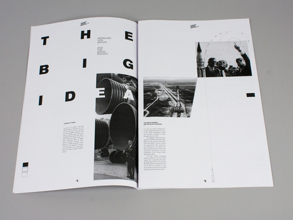
The Idea
The newspaper covers famous German-Americans in the history of the United States. Back in the 1800’s, many Germans came to the U.S., especially Minnesota, and took a big part in the cultural and industrial development. The museum newspaper tells their stories and brings back to mind how America became the country it is today.
Typical German design elements and the importance and achievements in typography were the basic inspiration to create a great reading and design experience for the reader.
Delivery of Work
Simple, bold, geometric shapes in black and white are typical elements of German design and create a connection of German-Americans with their origins. The high contrast of the shapes and colors represent the big step they took by deciding to leave their country to move to America.
The clean and highly composed page layout with a typographical and graphic message communicates the subject matter. Therefore, it is not even necessary to read the text to be able to find out and enjoy the content. Through those elements, people of all ages with German origins or with an interest in history, can inform themselves about their origins, or about an important part in the history of the United States.
The Results
Each double-page spread composition with the focus on a typography made readers to stay on a page. They enjoyed the compositions and the ideas behind the typographic design. The message of a German style was obviously communicated by the title, but also achieved in the design itself.
Credits
Event Sponsors


Additional generous support provided by Lagunitas Brewing Comapny and The Fraternal Order of Eagles #34