-
Categories
- All Winners
- Branding
- Environmental Graphics
- Interactive
- Miscellaneous
- Motion Graphics
- Packaging
- Publications
Mao to Now Poster/Mailer
By Daniel Jasper
The Idea
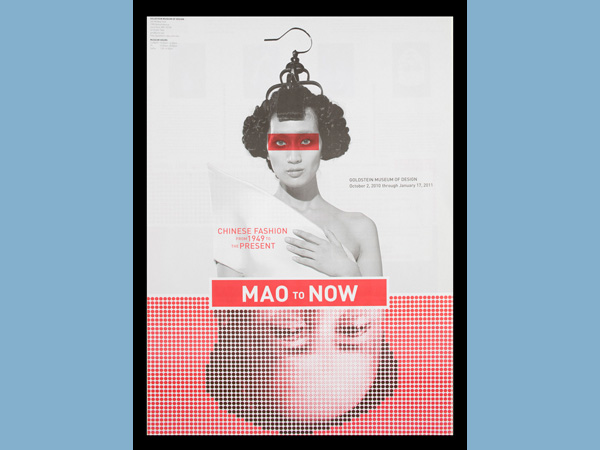
The objective of the poster/mailer was to promote an exhibition of Modern & contemporary Chinese fashion called Mao to Now at the Goldstein Museum of Design at the U of M. The typical Goldstein Museum patron is more mature. The typical Goldstein exhibitions are from established collections like the Eames, Halston and Russel Wright. The Mao to Now exhibition was a departure from the norm in that it featured contemporary and up-and-coming designers at the forefront of Chinese haute couture. Some of the work in the exhibition was controversial touching on political, environmental and sexual themes. All of the work was highly conceptual yet functional in form. In addition to announcing the show to the existing Goldstein audience the poster/mailer was designed to appeal to a younger demographic in an ongoing effort to establish a relationship with the next generation of Goldstein patrons.
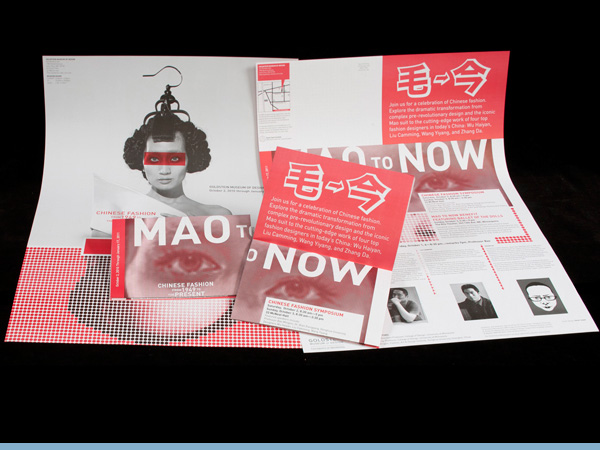
Delivery of Work
The poster/mailer was disseminated primarily through direct mail both regionally and nationally. Also the posters were hung in public throughout the Minneapolis and St. Paul area both on campus and off. Finally the posters were installed--as wallpaper--outside the gallery as part of the promotional identity for the exhibition.
The Results
I worked closely with the exhibition curator, Juan Juan Wu. Dr. Wu is an assistant Professor in the Apparel Design Program in the College of Design and the author of the book "Mao to Now: Chinese Fashion from 1949 to the Present".
The Chinese fashion designers were closely affiliated with the exhibition. They were guests at the opening reception and they were the focus of the two day symposium that ran in conjunction with the exhibition opening. As a result there was some sensitivity as to how Chairman Mao might be represented in the poster. There was agreement that he had to be depicted because his name was in the title but the designers wanted his visage to be muted.. While the exhibition title implies that the 'now' is a triumph over 'Mao' it was also important, for political reasons, that his depiction not be interpreted as disrespectful.
Dr Wu has idiosyncratic tastes and she wanted red polka-dots to somehow be a part of the announcement along with the colors black and white. I saw the polka-dots as a useful device with which to mute Mao's image and political edge. After all it is difficult to be interpreted as being too serious if one is peering through a screen of polka-dots. His image was inverted and his rounded forehead became an egg shape from which the fashion model representing 'now' emerged; much like one of Terry Gilliam's animations for Monty Python television programs.
The Mao to Now exhibition was the most attended show in both the 2009/2010 and 2010/2011 seasons. The Chinese fashion designers were very pleased with the identity depicted in the poster/mailer, feeling that it struck the proper balance of regard for the old with the insouciance of the new. I am currently developing the identity and promotional materials for the Goldstein's upcoming exhibition.
Credits
-
Art Directors
- daniel jasper
-
Production
- daniel jasper
Event Sponsors


Additional generous support provided by Lagunitas Brewing Comapny and The Fraternal Order of Eagles #34