

In May 2011, five Magnum photographers – Paolo Pellegrin, Jim Goldberg, Susan Meiselas, Alec Soth, Mikhael Subotzky – and a writer, Ginger Strand, set out from Austin, Texas, in an RV. Two weeks and 1750 miles later, they arrived in Oakland, California.
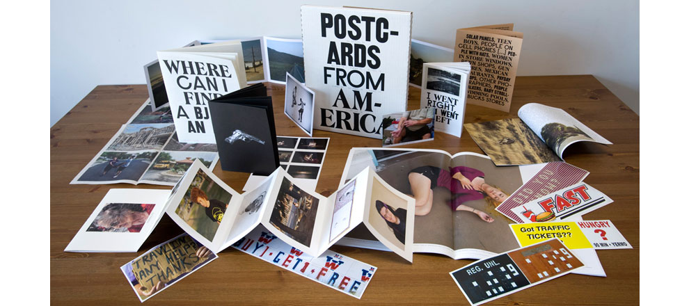
The photographers approached us with hundreds of photographs, but no plan for how to tell a story with them. We decided to map their individual journeys and unique narratives, as well as their collective experiences, into a variety of publication formats, all encapsulated within one framework. The resulting limited edition book is a collection of objects – a book, five bumper stickers, a newspaper, two fold-outs, three cards, a poster and five zines, all in a signed and numbered box – that together document the experience.
The diversity of materials, paper stock (newsprint, glossy, uncoated, cast-coated), printing methods (digital, traditional offset, web) was also in service of the larger idea of American diversity, and the lack of one single perspective.
The design process was a very seamless collaboration with one photographer in particular: Alec Soth. He has a very strong eye for design, and approached us looking for unique production methods and conceptually interesting approaches towards book design. Each photographer weighed in on their own contributions, some more than others.
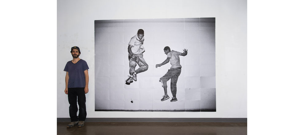
One of our favorite pieces in the book is a photo of two boys jumping by Paolo Pellegrin that we printed lifesize, and requires the reader to tile 64 pieces of paper to create a wall mural.
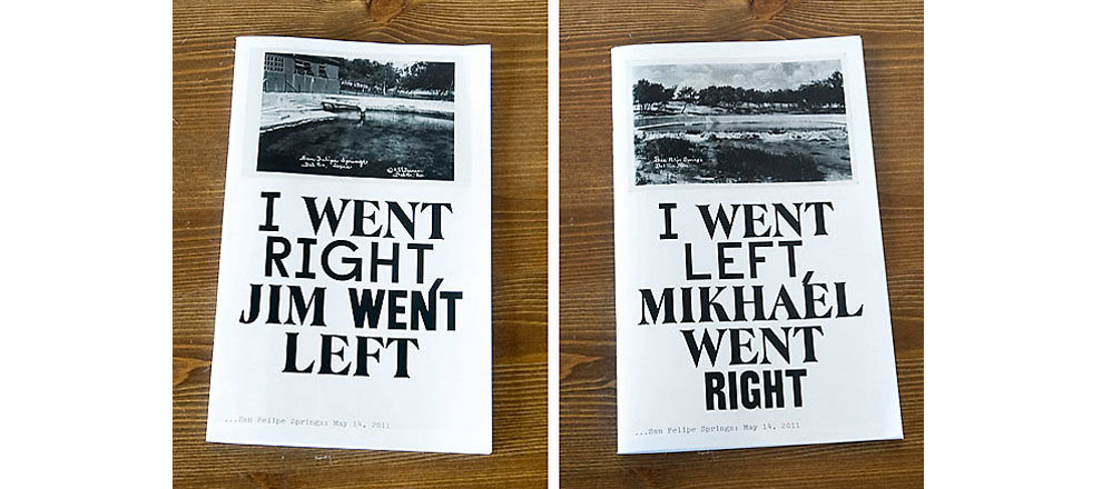
Another was a small zine that tells two stories that intersect at the middle of the book — two photographers started in one place and had two separate journeys and returned to the same place.
Typographically, the three intermingled faces were used to reference American vernacular typography and sign painting, without directly emulating it. The slightly schizophrenic treatment was also meant to reference the multitude of voices in America. The typewriter typeface for the body copy was used to imply a sense of roving journalism.
Delivery of Work
The photobook world is interesting and we had to deal with issues of collectibility when creating the book. The natural impulse was to make a very natural, casual, lo-fi piece to reflect the off-the-cuff nature of the laid back journey, but we had to remember that these books would be sold for hundreds of dollars, and that we needed to balance the more humble production methods (like black and white printing on newsprint) with more high-end production (4-color offset repro on glossy).
The Results
The book is selling quite well, and was reported on by the Huffington Post, Time Magazine, and Slate.
-
Graphic Designers
- Emmet Byrne
- Michael Aberman