-
Categories
- All Winners
- Branding
- Environmental Graphics
- Interactive
- Miscellaneous
- Motion Graphics
- Packaging
- Publications
Station K & Company Agency Branding
By Station K & Company
The Idea
Designer Jeff Holmberg of Holmberg Design Co. was hired to design a logo, identity system, website and style guide for the new Station K & Company marketing and advertising agency. The brand had to be distinctive, authentic, warm, approachable, and have a vintage or “worn” feel to it. It also needed to convey the energy, fun, and whimsy of this industry. The logo needed to convey professionalism and credibility without being too stuffy. It needed to be clean and easy to read without being contemporary. The system needed to be clever and thoughtful, but easy to understand. It needed to be unique and unexpected. It needed to be perfectly imperfect.
In addition, the whole brand system needed to work hard and get mileage out of just a few pieces. It also needed to be interchangeable and flexible to grow with the business and change with our needs.
The name Station K & Co. was derived from the classic train station. Train stations have good energy, they have people making connections, and they are destinations to see. There are many synergies between these concepts and business – working with people, creating relationships, staying on track, positive creative energy, and endless possibilities. The juxtaposition of these two ideas seemed to have some real branding power and potential, and was the foundation of Station K & Company’s entire brand system.
The design process began with some creative direction from owner, Karen Althen. She prepared a portfolio of various samples that were intended to showcase to the designer who she was and what was important to her. It included phrases, marks, colors, shapes and designs that she liked. For example, she likes watermarks, monograms, wax seals, beading and nail head trim, grosgrain ribbon, tassels, stamps, crests, and stripes.
The sample portfolio also included brands and products that she would purchase anything French inspired, Anthropologie, Restoration Hardware, and Caldrea. It included photos and samples of these items to give the designer some texture and feel to her preferences. Althen also outlined some color palette and shape guidelines to work with.
Althen challenged the designer to create two logos that could be used within the same system. The round logo was created as the main logo clean, easy to read and versatile in various formats. The oval logo was created in order to showcase the Quality Marketing & Advertising tagline that explains what the business does. It was important for Althen to have both, and both are consistently used on different materials. In addition, Holmberg also created the boxcar logo which is a horizontal format used on agency postcards and select other materials. All three logos have common elements that unite them, but each one showcases something individual and unique about the brand.
After the initial discussion and presentation of these concepts and ideas, Holmberg went into his own Discovery Phase, which included research about vintage trains, typefaces, marks, and collateral that could be used for inspiration. He created an Inspiration Board that he used throughout the process to validate his work against the authenticity benchmark we’d created. The first round of logo reviews included no fewer than 15 concepts to look at.
The olive green and burnt orange colors for the brand were chosen because these were the original colors of printed paper train tickets, and they are warm, neutral tones. The CopperJack font that is used most closely resembles vintage train boxcar lettering, and reflects the authenticity we were looking for.
As part of the website development, the designer went out and took original black and white photographs of old buildings, city landmarks, train stations, and other venues that would lend their look and feel to the Station K & Co. brand, while personalizing it to Minneapolis. These photos were not part of his original estimate he went out and took them because he didnメt find anything else that suited his impeccable taste and what Althen was looking for. That’s what we love about Jeff Holmberg he over delivers on everything and never ceases to surprise and delight with his work and attention to detail.
Pieces that Holmberg created for the system:
– Three (3) logo marks round, oval, boxcar horizontal
– Website
– Business Card
– Postcard/Thank You Card
– Agency Capabilities Card
– Meeting Cards
– PowerPoint Templates
– Gift Tags
– Various stickers – round logo, oval logo, file folder labels, and project jacket/mailing labels
– Two (2) styles of notepads
– Agency Tenets Poster – This Is How We Roll
– Various stamps for the collateral pieces
Delivery of Work
Holmberg recommended custom cardstock paper and letterpress printing for most of the collateral. This format ensured a unique and distinctive statement by any piece that was distributed. The letterpress printing gives a three dimensional feel and nice texture to the collateral especially the business cards which are handed out frequently. Holmberg designed the system so that it could be cost-effectively printed on large pieces of cardstock and sticker paper to maximize units produced while minimizing cost for a start-up agency.
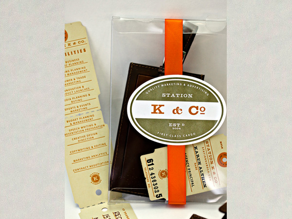
The materials for the Station K & Co. Press Kits were designed around a custom, leather luggage tag that is embossed with the agency logo. In keeping with the train theme and transportation, the luggage tag was the perfect giveaway with a practical use for the recipient. Holmberg designed an モAgency Capabilities Cardヤ that was inserted into the luggage tag showcasing the work of the agency. The capabilities card design mirrored the image of the unique business cards already created. The luggage tag was then inserted into a clear box, along with a business card, and sealed with ribbon and a branded sticker. Press kits were mailed out to business associates, current and prospective clients, industry colleagues, agency partners, and friends and family to formally introduce Station K & Company.
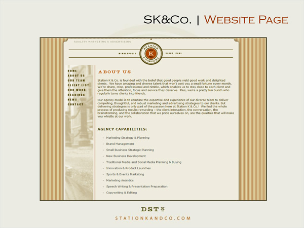
The Station K & Co website took design cues from the other collateral that had been created. The flash モrolling messageヤ featured on the home page is a nod to the train schedules that are found at stations and includes key phrases like, Let's Connect, and Whistle While You Work that have become part of the everyday vernacular at Station K. The home page also features words such as Collaborate, Compass, and Conjunction that play on the Co of Station K & Company and align with the overall theme of the brand. They set the tone for what the agency stands for and how they like to work with clients.
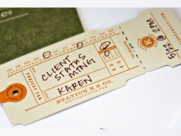
The Meeting Appointment Cards that Holmberg created are a classic take on a vintage item. The design replicates the format used to communicate date and time of train departures. Stamps were created to use in conjunction with these cards to list a specific agency contact name and phone number. The ticket stub tears off for the agency to keep note of the appointment details given to the client. These cards have been used to book follow-up meetings with clients, partners and business associates when they are at Station K & Co. offices.
The Results
The entire brand design is warm, classic, uncomplicated, versatile, and highly effective. Thereメs not one person we give a business card to who hasn't stopped to spend time with it. We usually hear a Wow! or Cool! They like to look at the card in vertical format instead of the usual horizontal. They like to feel the card heavy stock in cement green color, with letterpress printing. They note the character and distinctive features shaped like a tear-off train ticket, a stamped name and phone number makes each one unique, and the orange tab sticker is a subtle detail that reinforces the genuineness of the brand and its approachability.
The branded system created by Holmberg is adaptable enough to be used by the agency for a multitude of purposes: business development materials, new business pitches, client meetings and work, speaking engagements and presentations, press kits, internal stationery, thank you cards, invitations, office d'cor, even employee handbooks and team feedback forms. The concept was further expanded to develop an agency tenants poster, This Is How We Roll, that is displayed in the agency lobby.
The system has been extremely user-friendly, flexible, and sustainable. The stickers have been the most impactful piece they are used everywhere! They make any folder, presentation, media kit or mailing look custom and well-branded. Holmberg has successfully and skillfully executed a system that works in all these mediums without the dreaded brand overkill.
The brand personality, design and language created by Holmberg are even more than these materials however ヨ they are the foundation for much of the culture, energy and work that is done at Station K & Company. It mirrors Althen's personal brand and that which she instills in her team. If a marketing agency doesn't have a good brand, then how can a client trust them with theirs?
Credits
-
Graphic Designers
- Jeff Holmberg
Event Sponsors


Additional generous support provided by Lagunitas Brewing Comapny and The Fraternal Order of Eagles #34