
As we assessed our previous .com and social media presence, we realized there was opportunity for improvement. Our previous interactive experience didn’t accurately demonstrate who we are and what we’re great at. It also didn’t allow for the flexibility required by the dynamic nature of social media and agileness of mobile. If we could improve in these specific areas, we knew we would create a stand-out interactive experience.
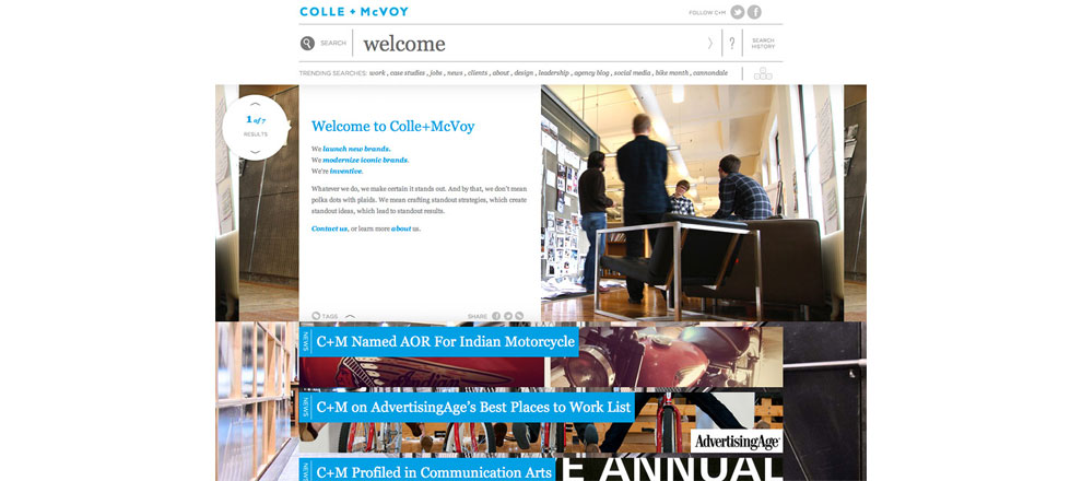
Our findings from the qualitative and quantitative research we conducted uncovered what makes C+M more than an advertising agency. We invent analytics tools from scratch. We write job descriptions for clients. We offer strategic counsel on business-level strategies. We offer fulfillment capabilities in house. We build 3-D dioramas. The engine that makes all of this possible is the people who work here. And here is a special place. Employees and clients described the feeling they get when they walk off the elevator at C+M, and that feeling is what we wanted our online experience to emulate. We worked off the key insight that C+M is more than just a workplace; it’s the incubator for and manifestation of the vibrant, warm and open spirit of its people.
Delivery of Work
With this insight in mind, we initiated a complete run-through of potential conceptual architecture solutions before creating visual design concepts. We explored organizational schemes based on four distinct audience profiles that we brought to life through personas and use case scenarios. We mapped out an agile experience that made itself smarter over time. An experience based heavily on search and a sophisticated tagging system, allowing site visitors to easily obtain content they find relevant and useful.
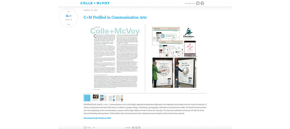
Our user experience strategies led to multiple design concepts. One prevailed. The one you’re experiencing now. As we brought people through a prototyped version of the website, they reacted positively to the design and photography style. We hope your reaction is the same, but we also want to make sure the experience easily and efficiently delivers the information you’re seeking.
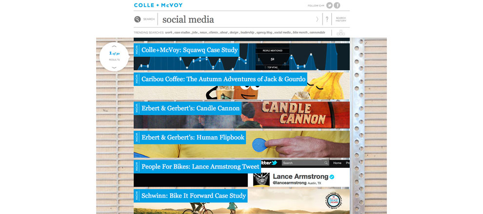
During our usability sessions, we observed people hesitantly browsing through our progressively created navigation system, built on the search-based tagging previously described. We offer five ways for people to navigate: 1) entering a search query, 2) clicking on a trending topic, 3) vertically scrolling through image tiles, 4) horizontally browsing via contextual links and 5) using the keyboard. Usability findings led to design and functionality tweaks that resulted in an experience surpassing the standards our team set. Time to go live.
The Results
• Increased traffic 10% on average per month since site launch
• Frequency of C+M social mentions and sentiment is at an all-time high
• Average time on site has increased 50%
• Twitter and Facebook followers increased 70% immediately following launch
-
Production
- Colle+McVoy