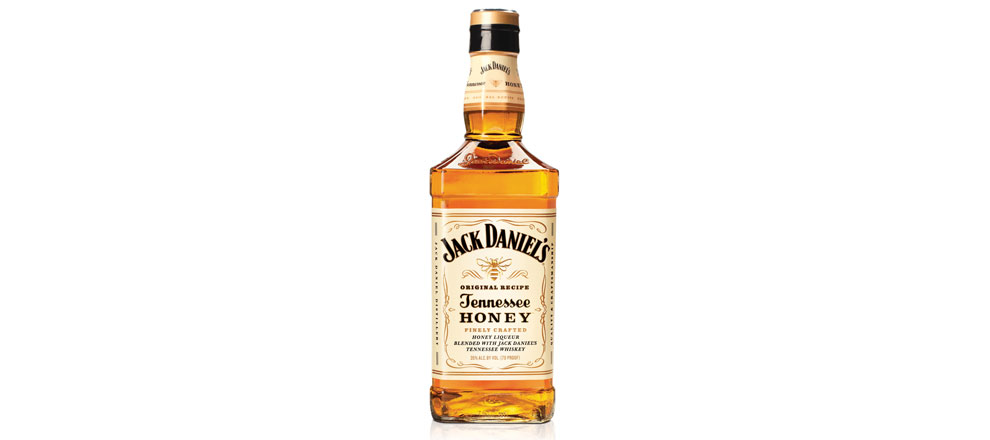

Tennessee Honey is the first new Jack Daniel’s expression in more than a decade, so part of what we had to solve was how to create an identity for the brand’s first flavored whiskey, while delivering a product that was unmistakably Jack Daniel’s.
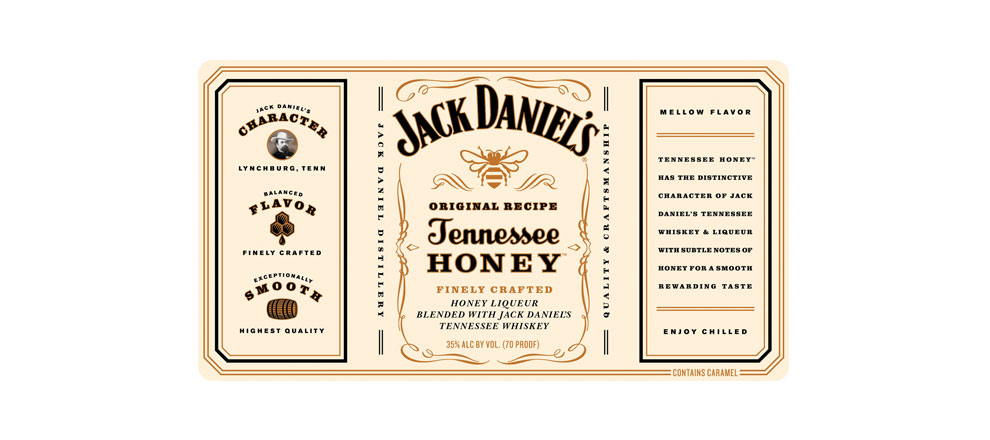
Working with the Jack Daniel’s brand team, we deconstructed the Jack Daniel’s brand iconography with consumers to understand what elements are most important and why. Using our knowledge of the brand and category, we created a brand identity that delivers the promise of a honey liqueur with natural flavor and sweet notes for a smooth, easy to drink taste. The result is a distinctive solution that feels like it’s always been part of the family.
Delivery of Work
Designing the brand identity, brand language and label for Tennessee Honey required balancing the brand’s equity with cues borrowed from the category of flavored whiskeys. The goal was to introduce new customers to the Jack Daniel’s brand without straying too far from the brand’s established identity.
The Results
Jack Daniel's Tennessee Honey is one of the most successful new product launches in Brown-Forman's history. It quickly became the leading brand in its product segment and now sells more than all of its competitors combined. It has been exciting to see the energy and enthusiasm that the product has generated, and how quickly people have accepted the new expression.
-
Creative Directors
- Alan Colvin
-
Graphic Designers
- Nathan Hinz
- Paul Sieka