


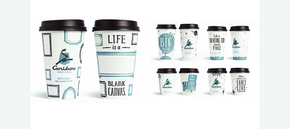

•Cups and napkins, became the walking billboards for the brand.
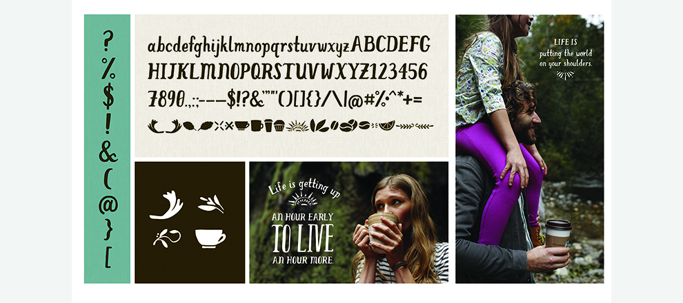
•TV and radio spots with “Life is…” messaging called on consumers to make the most of every day.
•3-D OOH bulletin sported a giant coffee cup.
•Mobile banners focused on generating traffic.
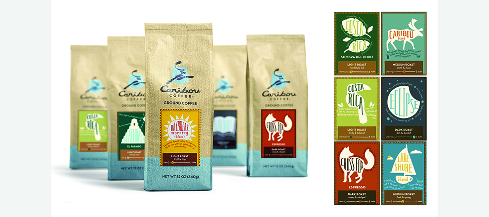
In 2012, a new set of challenges faced the brand. Caribou had grown extensively into markets outside of Minnesota. We needed to make sure Caribou was introducing its best self to new customers and reminding existing customers why they fell in love with Caribou in the first place. Our goal was to refocus and evolve the brand presence to be single-minded with a distinct point of view.
The brand history and the values Caribou was founded on make up its DNA. And customers share these values, which led to the core insight and campaign theme: “Life is more than coffee. That’s why there’s coffee.” It demonstrates how Caribou fans view life and highlights Caribou’s longstanding tagline, “Life is short. Stay awake for it.”
Social feeds became flooded with customer photos of the new brand elements, such as cups and napkins. Online conversations soon followed. Some messages even inspired fan mail and customers began requesting reusable versions the designs. Caribou was clearly distinguishable from others in the market and as a result, Caribou stock hit an all-time high.