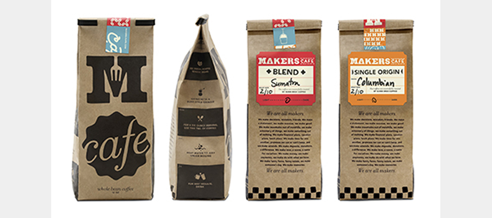
Inspired by handcrafted design and printing, the Makers logo features unique selections from an assortment of antique type specimen books and old woodblocks. The core "Makers" mark is a constant, but the “Café” tag is stamped on as an additional element, creating a layered, hand-crafted look. We also created a secondary, abbreviated mark for in-store purposes and for when the full name isn't necessary.
Dunn Bros Coffee wanted to launch a new restaurant concept. They had a name and a vision for a quick-serve restaurant that served handcrafted food, sustainably grown and largely local. Riley Hayes did the rest. We positioned the restaurant within a crowded category and brought the brand idea to life, but it all started with the logo. What would Makers Cafe be? How would it live up to, but not over-promise, what a QSR could deliver? We created the authentic foundation for Makers Cafe.
It supported a hugely successful soft launch, beating client sales and traffic expectations, beaconed people to walk into the restaurant from the street, and differentiated what Makers Cafe offers from the other QSR competitors in the area. The work leaves Dunn Bros confident that they have a winner as they roll into the full launch of Makers Cafe.


