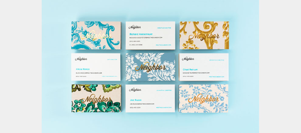
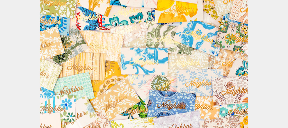
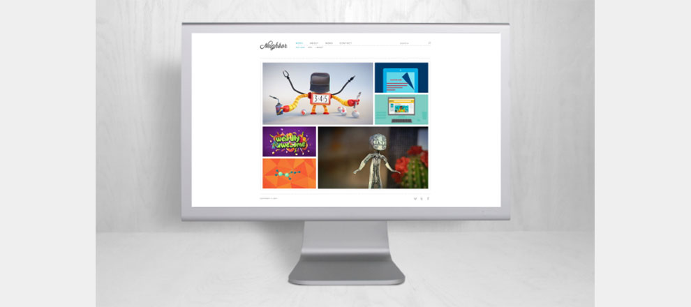

The friendly yet simple identity (name, look, voice) speaks to the Minnesota roots of the company, as well as the collaborative, “NEIGHBOR-ly” work process. The logo reached the masses in every conceivable brand touch point – stationery suite, literature, social media, and website.
Create a framework that positions NEIGHBOR as a compelling, differentiated choice for motion design, while considering the audiences that need to be won over in order to succeed.
Create a unique and memorable visual statement for NEIGHBOR that differentiates them from the pack.
The clients were pleased to have a strong logo and identity system to set them apart and showcase their skills – both as a business and for its employees.