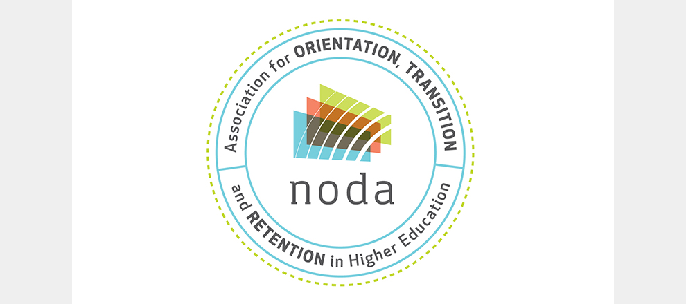
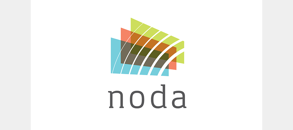
Accompanying the completed logo was a comprehensive brand style guide to explain when and how to use the different logo versions along with identifying colors, fonts, and patterns.
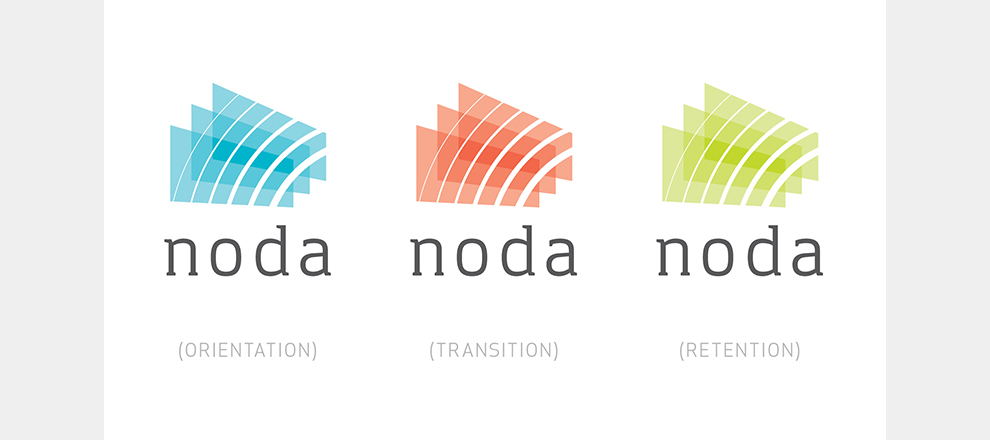
NODA, an organization that focuses on training facilitators in higher education to better reach students, approached us to rebrand them in a way that is straightforward but fun. The overlapping bright layers representing their main steps; orientation, transition and retention do just this.
We successfully worked with NODA for a logo/identity overhaul that puts the 'fun' back in 'mandatory function.'


