


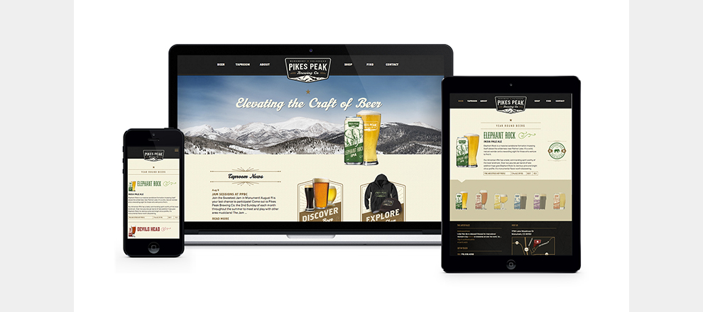
The rebrand was rolled out via new logos, website, posters, billboards, ads, clothing and other merchandise, beer labels, tap handles, tapper toppers and icon system.
Finally with a consistent brand message and design (and detailed brand guidelines to boot), PPBC was able to effectively create in-house collateral, including a charity beer label to honor firefighters in Colorado, ambulance truck wrap and water tower sign. Regional consumers – be it locals, beer connoisseurs or visitors to the area, could now identify with PPBC and its unique beers. What’s more, PPBC now had the marketing and design collateral it needed to support its growing wholesale accounts.
With new investors behind the Pikes Peak Brewing Company (PPBC), a recent expansion of the brewery and tasting room and soon-to-be expansion of production, PPBC was in need of a brand refresh that could clearly indicate quality over quantity, give regional consumers a sense of place and also be scalable for future flavors, merchandise and new market locations. What’s more, PPBC was looking to increase its wholesale sales and locations.
The design brief centered on PPBC’s competitive advantage – a community-centric atmosphere with a local presence, which also produces quality beer. Key words were identified that further illustrated the quality of the beer, such as ‘stylistic,’ ‘down-to-earth,’ and ‘classic.’
The client was very interested in fonts, so most of our discussions centered on ways to create custom fonts to convey the handcrafted quality of the beer.
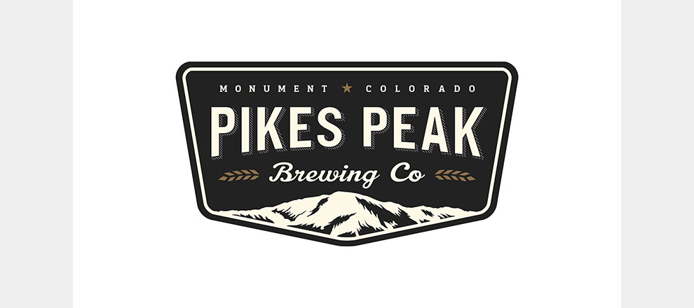
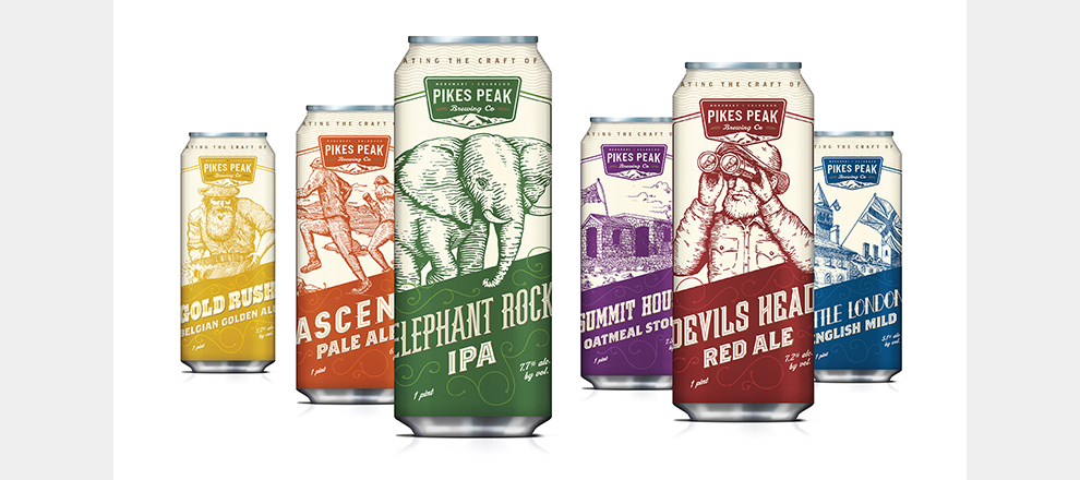
The brand and packaging needed to be simple and identifiable to existing customers, but also capitalize on the 500,000+ regional consumers within the Colorado Springs area. After extensive competitor research, Westwerk crafted a logo that was modern and clean, without departing too much from the original PPBC logo so as to not alienate existing customers. Can designs were created using hand-drawn artwork to reinforce the artisanal, hand-crafted qualities of the micro beer, and the artwork depicted iconic regional locations like Elephant Rock and Devil’s Head in order to convey the sense of place to consumers. These concepts were translated into an icon system, posters, advertisements, a website and tap handles, further allowing consumers to identify the brand, flavors and quality.
The complete rebrand gave Pikes Peak Brewing Company the leg up it needed within the competitive microbrew industry of Colorado, and the new designs, that finally matched the quality of the beers, gave consumers a reason to consider Pikes Peak.
The average monthly wholesale sales has grown 250 percent (year over year), primarily due to offering the product in cans with supporting merchandise and recognizable tap handles and toppers. Tasting room sales are growing at an average rate of 37 percent year over year, and overall consumer reception has been incredible.
Pikes Peak Brewing Company is thrilled to see such a long-term investment start moving the needle immediately.
Wholesale, retail sales and tasting room traffic have all increased, and the bottom line has been positively impacted by the rebrand.
The rebrand continues to increase awareness of this regional, high-quality brewery among its 500,000+ metro population.


